Visualizing Confidence Intervals in Dot Plots
Jul 15, 2015 · 3 minute readRdataviz
Update 2017-04-05 This is a lot easier to do in ggplot2, so I would investigate that option instead. See this post for a starting point.
There is a movement, spurred by people like John Ioannidis (who wrote Why Most Published Research Findings are False 10 years ago) and Geoff Cumming, to de-emphasize p-values and significance testing in favor of effect sizes and confidence intervals. I’m not as statistically literate as either Dr. Ionnadis or Dr. Cumming, but their arguments are reasonable to me. In fact, it’s kind of amazing that changes have taken this long. Institutional inertia is powerful.
To move forward, though, we need tools. Here’s one.
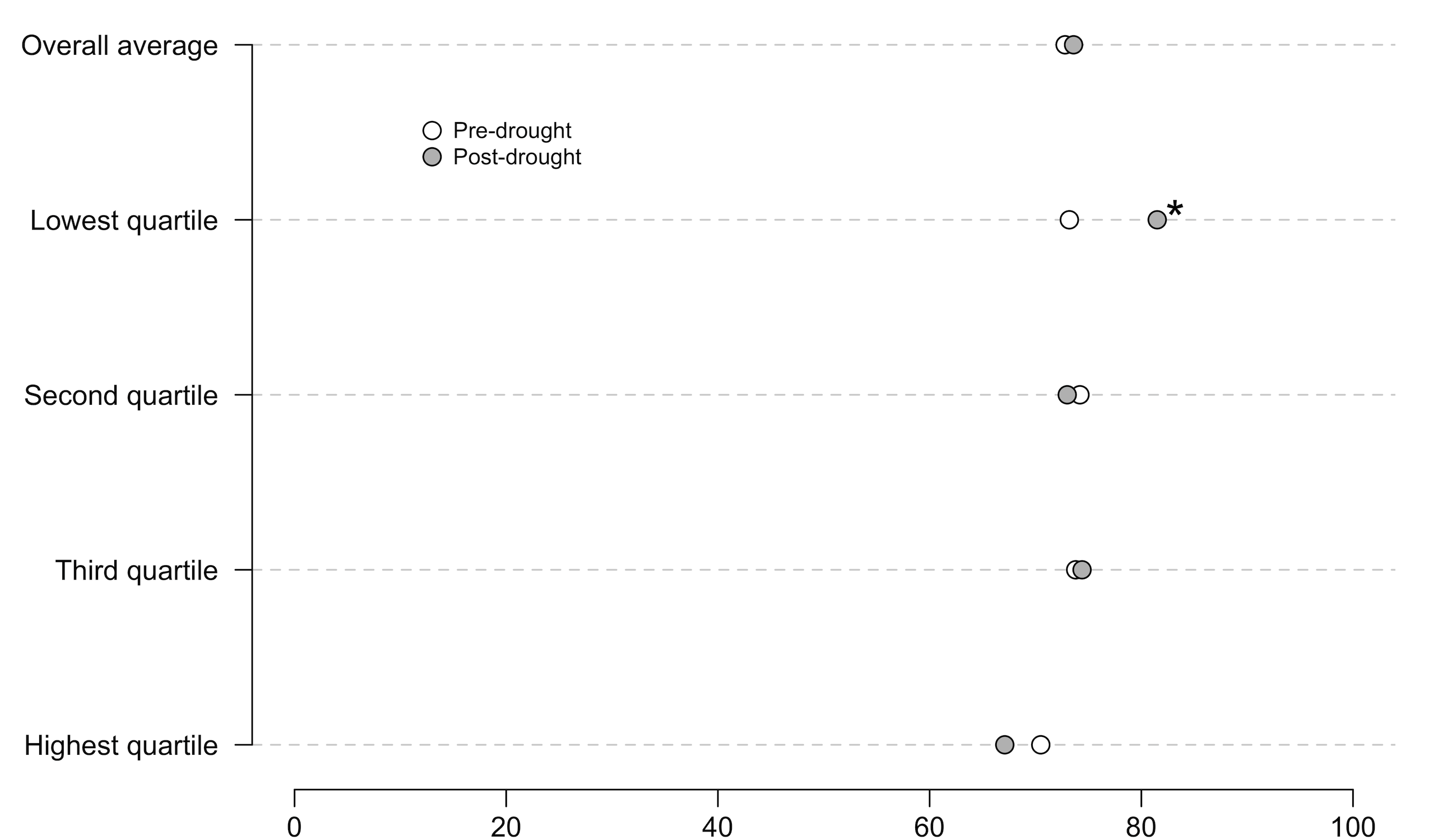
I use dot plots to compare data when there are obvious comparisons by groups, time, etc. Here’s an example from a paper that’s currently in review. As background, this plot compares the percentage of respondents who believe in climate change before and after a drought event. The quartiles measure the severity of drought experienced by respondents: the highest quartile are people who suffered the worst drought, the lowest quartile are people who suffered the least-bad drought. The * represents a statistically significant difference at the p < .05 level. The x axis should be labeled “% Believing in climate change”, but it isn’t :)

A perfectly nice graph. However, the dots are just point estimates with indicators of significance, which means they’re subject to the problems that Ionnadis and Cumming warn us about.
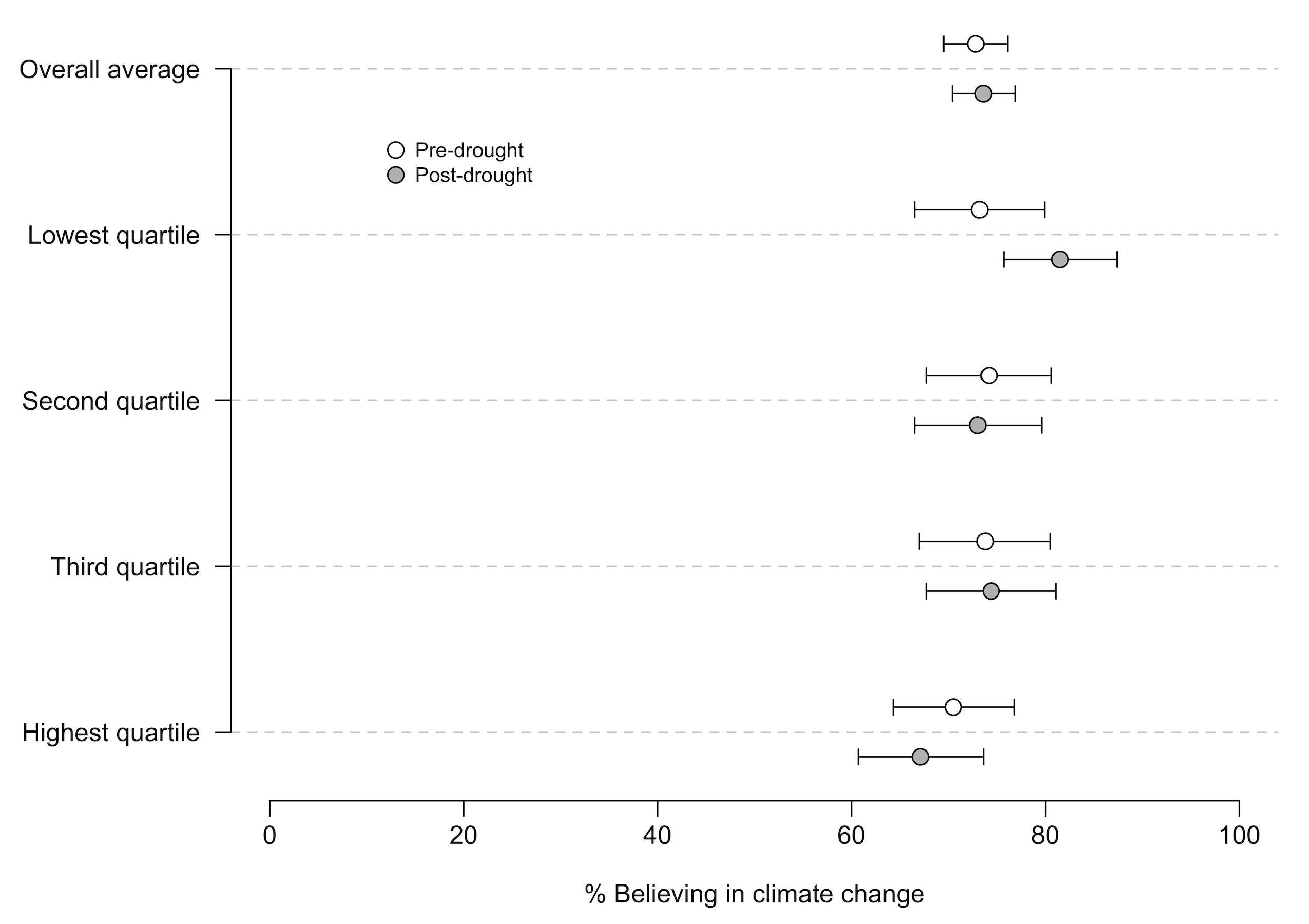
A better graph (which I may still be able to switch before publication…we’ll see) would have confidence intervals, like this:

This is a substantial improvement because it allows us to see the precision of the measurement. Note that I had to move the dots off the single line so that you can distinguish the CIs.
For a relative R newbie like me, it took a bit of tweaking to figure out how to do this. The secret: you can use the arrows command to draw CIs if you know the upper and lower CI bounds. Once you get that hack, the rest is fairly straightforward.
The initial version of the R code is below. I also created a GitHub repository where I’ll post updates. I’d like to find a way to make the process less manual and, therefore, faster.
# Set up data. Severity will provide the labels, pre is the pre-drought mean (i.e., point estimate), post is the post-drought mean. lowerCIpre and upperCIpre are the lower and upper bounds of the 95% confidence intervals for the pre-drought data, lowerCIpost and upperCIpost are the same for the post-drought data. If I were fancier, I could calculate those and store them as variables rather than manually input them from prior analysis. But I'm not that fancy.

severity = c("Overall average","Lowest quartile","Second quartile","Third quartile","Highest quartile")

pre = c(72.8,73.2,74.2,73.8,70.5)
post = c(73.6,81.5,73.0,74.4,67.1)

lowerCIpre = c(69.5,66.5,67.7,67.0,64.3)
upperCIpre = c(76.1,79.9,80.6,80.5,76.8)

lowerCIpost = c(70.4,75.7,66.5,67.7,60.7)
upperCIpost = c(76.9,87.4,79.6,81.1,73.6)

# Generate numbers for the y-axis. Note that we won't actually print the y-axis, but this helps to set it up.

y.axis <- length(severity):1

# Generate an adjustment value to move the dots up or down so you can see the intervals. You can, uh, adjust the adjustment value until you like how it looks.

adjustment <- 0.15

# Now, the actual graph.

par(mar=c(4.5,7.5,.5,1), lheight = .3)

plot(pre, y.axis + adjustment, type = "p", axes=F, xlab = "% Believing in climate change", ylab = "", cex = 1.4, xlim = c(0,100), ylim = c(min(y.axis - adjustment), max(y.axis + adjustment)), main = "")

abline(h = y.axis, lty = 2, lwd = 1, col = "light grey")

points(post, y.axis - adjustment, pch = 21, cex = 1.4, bg = "gray" )

# CI Bars using the arrows command. lwd adjusts line width

arrows(lowerCIpre, y.axis + adjustment, upperCIpre, y.axis + adjustment, code = 3, length = 0.05, angle = 90)

arrows(lowerCIpost, y.axis - adjustment, upperCIpost, y.axis - adjustment, code = 3, length = 0.05, angle = 90)

# re-draw the dots to make them appear over the CI lines

points(pre, y.axis + adjustment, pch = 21, cex = 1.4, bg = "white" )
points(post, y.axis - adjustment, pch = 21, cex = 1.4, bg = "gray" )

# add the axes

axis(1,at = seq(0,100, by = 20), label = seq(0,100, by = 20), mgp = c(.5,.6,.50), cex.axis = 1)
axis(2, at = y.axis, label = severity, las = 1, tick = T, cex.axis =1.0)

# Key labels

text(15,4.5, "Pre-drought", adj=0, cex = .8)
text(15,4.35, "Post-drought", adj=0, cex = .8)
points(13,4.51, cex = 1.4)
points(13,4.36,pch = 21, bg = "gray", cex = 1.4)