Visualizing Odds Ratios
Oct 24, 2015 · 1 minute readRdataviz
Although I haven’t had a chance to write it up yet, I like to use dot plots with confidence intervals to visualize regression results, as well. For example, here’s a figure from a recent paper (click to open in a new window):
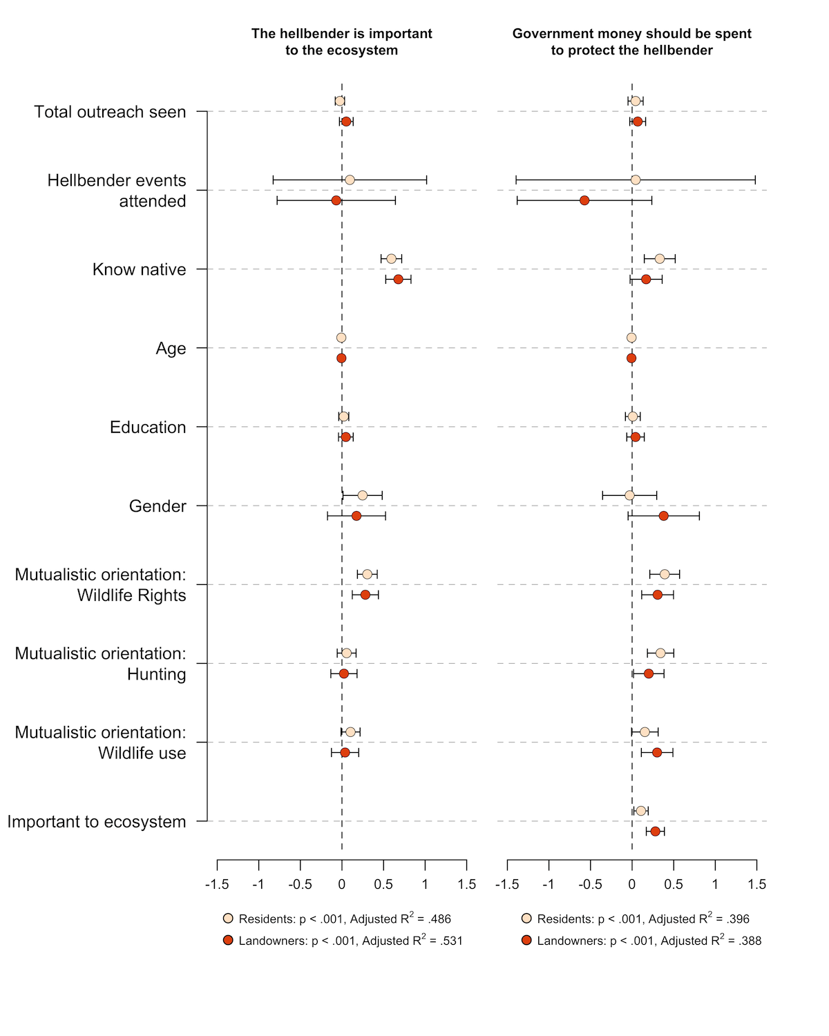
I like how this figure compactly presents four models, allowing for easy comparison. It’s a nice complement to regression tables.
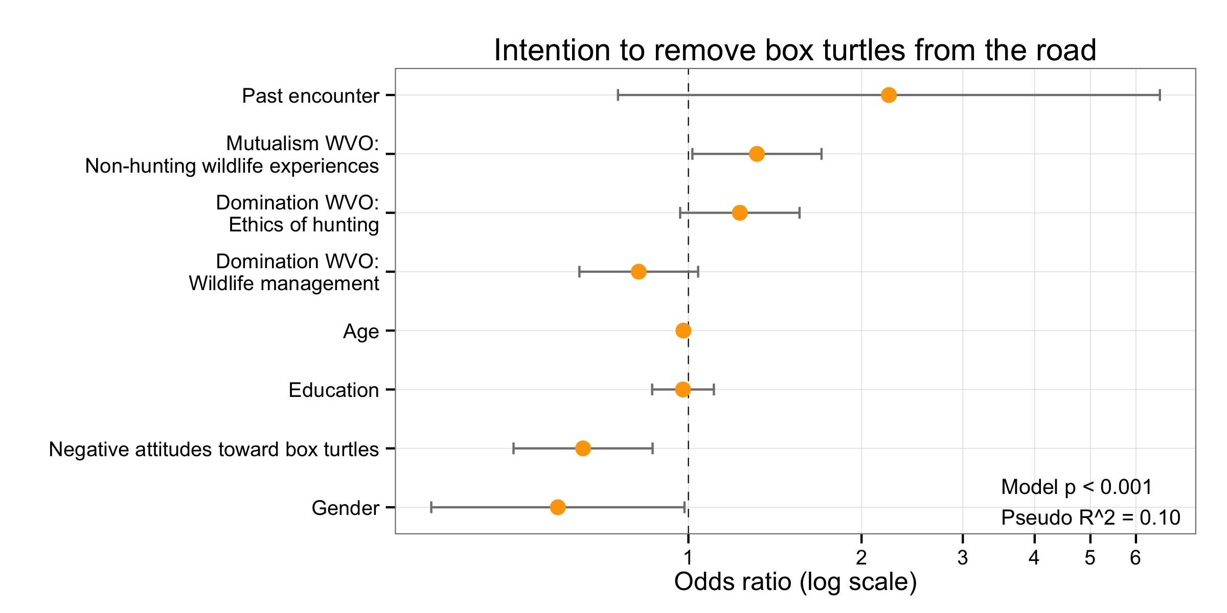
Logistic regression presents a problem for this type of graph because they typically should plotted on log scales, not linear. Fortunately, this is pretty easy to do in R and ggplot2. The trick is to use coord_trans(x = “log10”) to transform the axis. There are other ways to do it (e.g., scale_x_log10()), but this works with using scale_x_continuous to set the tick marks and labels.
Here’s an example (click to open in a new window):
And here’s the code:
library(ggplot2)

# Create labels
boxLabels = c("Past encounter", "Mutualism WVO:\nNon-hunting wildlife experiences", "Domination WVO:\nEthics of hunting", "Domination WVO:\nWildlife management", "Age", "Education", "Negative attitudes toward box turtles", "Gender")

# Enter summary data. boxOdds are the odds ratios (calculated elsewhere), boxCILow is the lower bound of the CI, boxCIHigh is the upper bound.

df <- data.frame(
  yAxis = length(boxLabels):1,
  boxOdds = c(2.23189,1.315737,1.22866,.8197413,.9802449,.9786673,.6559005,.5929812),
  boxCILow = c(.7543566,1.016,.9674772,.6463458,.9643047,.864922,.4965308,.3572142),
  boxCIHigh = c(6.603418,1.703902,1.560353,1.039654,.9964486,1.107371,.8664225,.9843584)
)

# Plot
p <- ggplot(df, aes(x = boxOdds, y = yAxis))
p + geom_vline(aes(xintercept = 1), size = .25, linetype = "dashed") +
  geom_errorbarh(aes(xmax = boxCIHigh, xmin = boxCILow), size = .5, height = .2, color = "gray50") +
  geom_point(size = 3.5, color = "orange") +
  theme_bw() +
  theme(panel.grid.minor = element_blank()) +
  scale_y_continuous(breaks = yAxis, labels = boxLabels) +
  scale_x_continuous(breaks = seq(0,7,1) ) +
  coord_trans(x = "log10") +
  ylab("") +
  xlab("Odds ratio (log scale)") +
  annotate(geom = "text", y =1.1, x = 3.5, label ="Model p < 0.001\nPseudo R^2 = 0.10", size = 3.5, hjust = 0) + ggtitle("Intention to remove box turtles from the road")