Plotting multiple response variables in ggplot2
Apr 5, 2017 · 6 minute readR
The problem: handling two sets of variables in ggplot2
A reader named Dan recently asked me how to plot multiple response variables using and odds ratios, kind of combining the two plots in this post.
The tricky part isn’t the odds ratios: it’s how to plot multiple sets of response variables on one plot. But even that isn’t too tricky…ggplot2 gives you a couple of relatively straightforward ways to do it.
The secret: setting up data how ggplot wants it to be set up
ggplot2 and the tidyverse make this kind of stuff easy if you set up your data properly. With multiple regression models, it’s tempting to create this kind of data set:
predictor   model 1 odds    model 2 odds    model 3 odds
pred_a      2.23            1.32            1.23
pred_b      0.82            0.98            0.98
But there’s a better way, at least if you’re using ggplot2 and the tidyverse: set up your data so that each model run is a different observation (i.e., row), like this:
predictor   model   odds
pred_a      1       2.23
pred_a      2       1.32
pred_a      3       1.23
pred_b      1       0.82
pred_b      2       0.98
pred_c      3       0.98
This setup allows you to do the filtering and faceting tricks that I use below, making plotting like running downhill.
Solving the problem: faceting and filtering
ggplot2 gives us two approaches to solving the problem: faceting and filtering. Let’s take a look at each.
Facetting is an application of Tufte’s small multiples concept that allows you to plot multiple graphs next to each other for easy comparison. Here’s how to plot multiple logistic regressions using facet_wrap in ggplot2.
Import the data
# load the tidyverse, first, which has the key packages we'll need.
library(tidyverse)

# To keep this file self-contained, I'll use read_csv to create a fake dataset.
df <- read_csv(
  "predictor, response, odds, CIHigh, CILow
  Predictor A, response 1, 2.23, 0.70, 6.60
  Predictor A, response 2, 1.32, 1.02, 1.70
  Predictor A, response 3, 1.23, 0.97, 1.56
  Predictor B, response 1, 0.82, 0.65, 1.04
  Predictor B, response 2, 0.98, 0.96, 1.00
  Predictor B, response 3, 0.98, 0.86, 1.11
  Predictor C, response 1, 0.66, 0.50, 0.87
  Predictor C, response 2, 0.59, 0.36, 0.98
  Predictor C, response 3, 0.98, 0.86, 1.11"
)
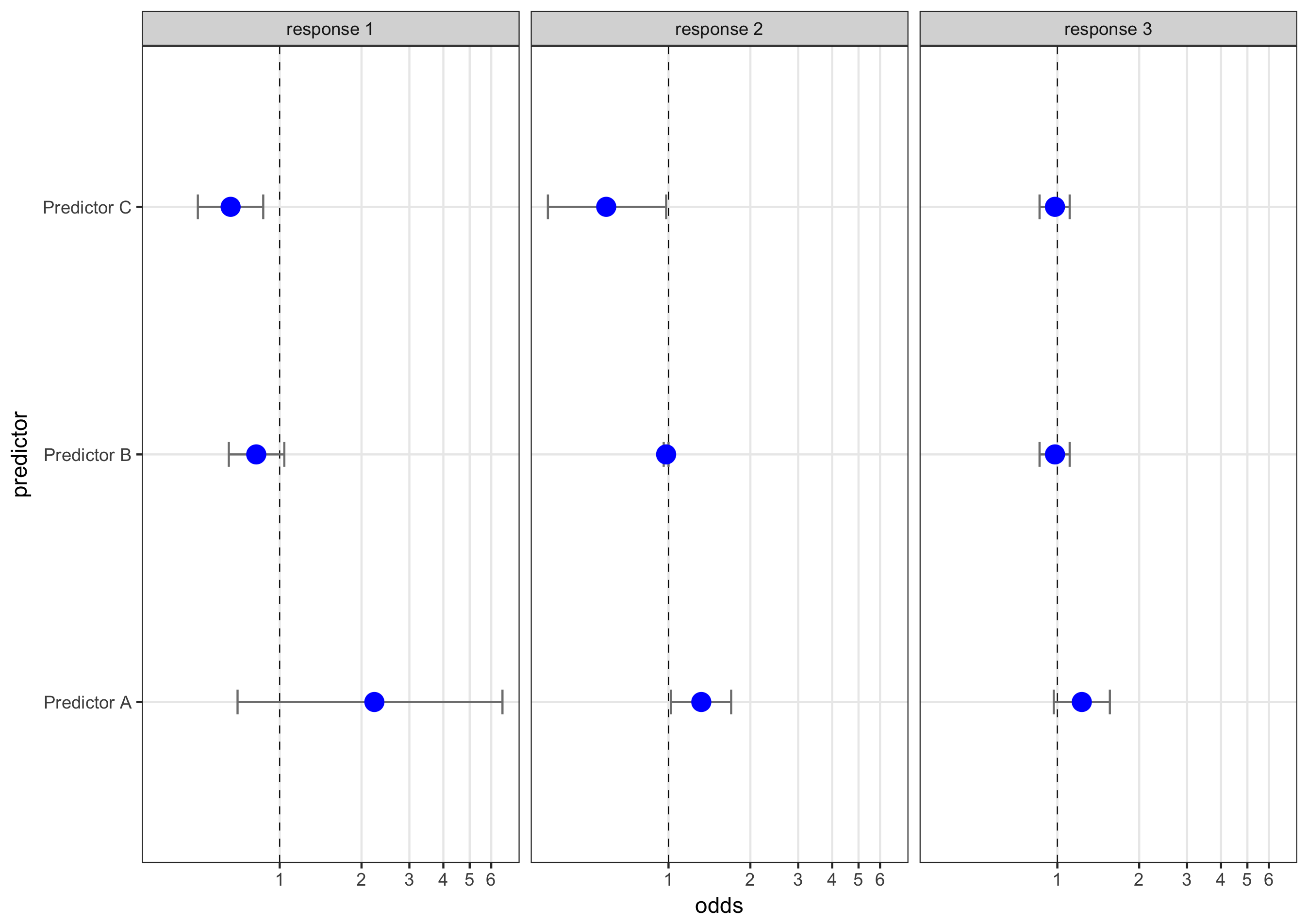
Use facet_wrap to create the plots
Next, I’ll use facet_wrap to create the plots and coord_trans to transform the x axis to a log scale. Note that I only took a couple of steps to make it pretty here…you can finish that job that on your own :)
ggplot(df, aes(x = odds, y = predictor)) +
  geom_vline(aes(xintercept = 1), size = .25, linetype = "dashed") +
  geom_errorbarh(aes(xmax = CIHigh, xmin = CILow), size = .5, height = .1, color = "gray50") +
  geom_point(size = 4, color = "blue") +
  facet_wrap(~response) +
  scale_x_continuous(breaks = seq(0,7,1) ) +
  coord_trans(x = "log10") +
  theme_bw() +
  theme(panel.grid.minor = element_blank())
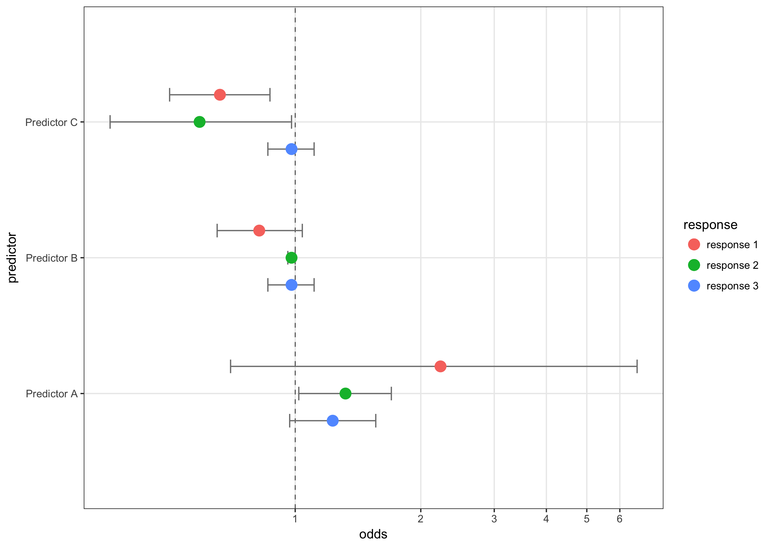
Use position_nudge to plot multiple models at once
The other option is to plot all of the models on one graph and use color and position_nudge to differentiate between them. This makes direct comparison more straightforward at the expense of clutter. Here’s how to do it:
# option 2: plotting them all on one graph. This requires a using filter to plot one set of points and CIs at a time and manually adjusting their height using an adjustment variable and position_nudge()

adj = .2 # This is used in position_nudge to move the dots

ggplot(df, aes(x = odds, y = predictor, color = response)) +
  geom_vline(aes(xintercept = 1), size = .25, linetype = "dashed") +
  geom_errorbarh(data = filter(df, response== "response 1"), aes(xmax = CIHigh, xmin = CILow), size = .5, height = .1, color = "gray50", position = position_nudge(y = adj)) +
  geom_point(data = filter(df, response== "response 1"), size = 4, position = position_nudge(y = adj)) +
  geom_errorbarh(data = filter(df, response== "response 2"), aes(xmax = CIHigh, xmin = CILow), size = .5, height = .1, color = "gray50") +
  geom_point(data = filter(df, response== "response 2"), size = 4) +
  geom_errorbarh(data = filter(df, response== "response 3"), aes(xmax = CIHigh, xmin = CILow), size = .5, height = .1, color = "gray50", position = position_nudge(y = - adj)) +
  geom_point(data = filter(df, response== "response 3"), size = 4, position = position_nudge(y = - adj)) +
  scale_x_continuous(breaks = seq(0,7,1) ) +
  coord_trans(x = "log10") +
  theme_bw() +
  theme(panel.grid.minor = element_blank())
Again, beautifying is left as an exercise to the reader. For completeness, you can find a version of the R script on GitHub or pasted right here:
# First, load the tidyverse package which contains ggplot2, readr, and dplyr, which we'll use
library(tidyverse)

# The key decision/challenge here is how to set up your data. ggplot2 really wants you to set your data up in a specific manner, and the reward for doing so is that plotting becomes like running downhill.

# To keep this file self-contained, I'll use read_csv to create a fake dataset.
df <- read_csv(
  "predictor, response, odds, CIHigh, CILow
  Predictor A, response 1, 2.23, 0.70, 6.60
  Predictor A, response 2, 1.32, 1.02, 1.70
  Predictor A, response 3, 1.23, 0.97, 1.56
  Predictor B, response 1, 0.82, 0.65, 1.04
  Predictor B, response 2, 0.98, 0.96, 1.00
  Predictor B, response 3, 0.98, 0.86, 1.11
  Predictor C, response 1, 0.66, 0.50, 0.87
  Predictor C, response 2, 0.59, 0.36, 0.98
  Predictor C, response 3, 0.98, 0.86, 1.11"
)

# Now there are 2 options. There is a ton of tweaking you can do to make each graph look pretty, but I'll leave that as an exercise for you.

# option 1: using facet_wrap to plot them next to each other

ggplot(df, aes(x = odds, y = predictor)) +
  geom_vline(aes(xintercept = 1), size = .25, linetype = "dashed") +
  geom_errorbarh(aes(xmax = CIHigh, xmin = CILow), size = .5, height = .1, color = "gray50") +
  geom_point(size = 4, color = "blue") +
  facet_wrap(~response) +
  scale_x_continuous(breaks = seq(0,7,1) ) +
  coord_trans(x = "log10") +
  theme_bw() +
  theme(panel.grid.minor = element_blank())

# option 2: plotting them all on one graph. This requires a using filter to plot one set of points and CIs at a time and manually adjusting their height using an adjustment variable and position_nudge()

adj = .2 # This is used in position_nudge to move the dots

ggplot(df, aes(x = odds, y = predictor, color = response)) +
  geom_vline(aes(xintercept = 1), size = .25, linetype = "dashed") +
  geom_errorbarh(data = filter(df, response== "response 1"), aes(xmax = CIHigh, xmin = CILow), size = .5, height = .1, color = "gray50", position = position_nudge(y = adj)) +
  geom_point(data = filter(df, response== "response 1"), size = 4, position = position_nudge(y = adj)) +
  geom_errorbarh(data = filter(df, response== "response 2"), aes(xmax = CIHigh, xmin = CILow), size = .5, height = .1, color = "gray50") +
  geom_point(data = filter(df, response== "response 2"), size = 4) +
  geom_errorbarh(data = filter(df, response== "response 3"), aes(xmax = CIHigh, xmin = CILow), size = .5, height = .1, color = "gray50", position = position_nudge(y = - adj)) +
  geom_point(data = filter(df, response== "response 3"), size = 4, position = position_nudge(y = - adj)) +
  scale_x_continuous(breaks = seq(0,7,1) ) +
  coord_trans(x = "log10") +
  theme_bw() +
  theme(panel.grid.minor = element_blank())